
Slow Reveal
Notice, Wonder, Connect
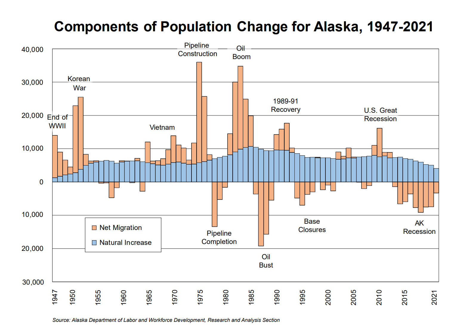
This graph shows the changes in Alaska’s population from 1947 to 2021. The blue shows the natural increase, (the difference between births and deaths) and the orange shows the net migration (the difference between people moving in and moving out). The natural increase gradually rises and falls over the last 55 years. The net migration varies wildly from high positive migration (people moving in) to high negative migration (people moving out). This graph shows how migration and natural increase each changed independently.
- How can you use this graph to figure out whether the overall population in Alaska increased or decreased in any particular year?
Overall population increases if either the net migration for that year is above 0 (see, for example, 1950) or, if there is a net migration below 0, if that net migration is less than the natural increase (see, for example, 2000). Recently, the overall population in Alaska has been decreasing, but increased in 2021 for the first time since 2016. That increase was due, primarily, to the influx of new personnel and their families to Eielson Air Force Base near Fairbanks.
Among the many catchy and informative headlines suggested by students for this graph are: “The Ups and Downs of Alaska;” “Those Who Came and Went;” and “The Population’s Love, Hate Relationship with Alaska, 1947-2021.”
There were many thoughtful and curious observations and questions posed by students and great connections to their own lives and families. We’ve answered some questions below and will do more research with experts to answer others.
Many students wondered why there was an increase in migration to Alaska during wars. In general, that’s because of Alaska’s location which is closer to Asia (where those wars were) than the rest of the U.S. is. Alaska has been an important military jumping off point for troops and planes since WWII. Eielson Air Force Base, for instance, southeast of Fairbanks, was established in 1943. Anchorage was a relatively small town prior to WWII and grew exponentially with the construction of Fort Richardson (Army) and Elmendorf Air Force Base in 1940-41. After the wars, when far fewer active duty soldiers were needed, many returned to their original homes; others, though, chose to stay in Alaska and create new homes here.
The oil industry has provided the other major booms and busts in Alaska population:
“Since statehood [1959], natural increase has provided Alaska with steady growth. In- and out-migration have been far more uncertain components of this population change, as the numbers of people moving into and out of the state have swung from year to year. The discovery of oil in Prudhoe Bay in 1968 and the subsequent construction of the Trans-Alaska Oil Pipeline in the 1970s reshaped Alaska’s population, immediately and in the following decades. Tens of thousands of workers and their dependents poured into the state for the construction of the pipeline, and many left upon completion. In the years that followed, a huge number of migrants flowed into Alaska with new oil revenue and higher oil prices, but a large number left when oil prices plunged in 1985.” Alaska Population Projections: 2021 to 2050, Alaska Department of Labor and Workforce Development, Research and Analysis Section
That article also provides more details about birth and death rates across the state.
“Alaska’s projected crude birth rate (the number of births per 1,000 people) for 2021-2022 is 13.0. With the aging of Alaska’s population, this figure is projected to decline to approximately 11.9 by 2050. Birth rates vary greatly across areas. The highest crude birth rates in 2021 were in the Kusilvak Census Area (27.4), Northwest Arctic Borough (23.6), and Bethel Census Area (21.4). The lowest birth rates were found along the Aleutian chain and primarily in Southeast Alaska. In the Aleutians East Borough and Aleutians West Census Area, where much of the population lives in group quarters for fishing and fish processing, the crude birth rates were 2.0 and 5.4, respectively. Other areas with low birth rates included the Haines Borough (6.9), Bristol Bay Borough (8.5), City and Borough of Juneau (8.6), and Petersburg Borough (8.9). …
Alaska’s crude death rate (the number of deaths per 1,000 people) in 2021 was 7.3. The greatest contributing factor was the ratio of senior citizens to the overall population. Like crude birth rates, crude death rates vary by area. The highest 2021 rates were in the Prince of Wales-Hyder Census Area (15.4), City and Borough of Wrangell (12.4), and Copper River Census Area (11.8). Those with the lowest crude death rates included the Aleutians West Census Area (2.7), Aleutians East Borough (2.8), and City and Borough of Yakutat (2.9). As Alaska’s population ages over the projection period, crude death rates will likely increase in all boroughs and census areas.” Alaska Population Projections: 2021 to 2050, Alaska Department of Labor and Workforce Development, Research and Analysis Section
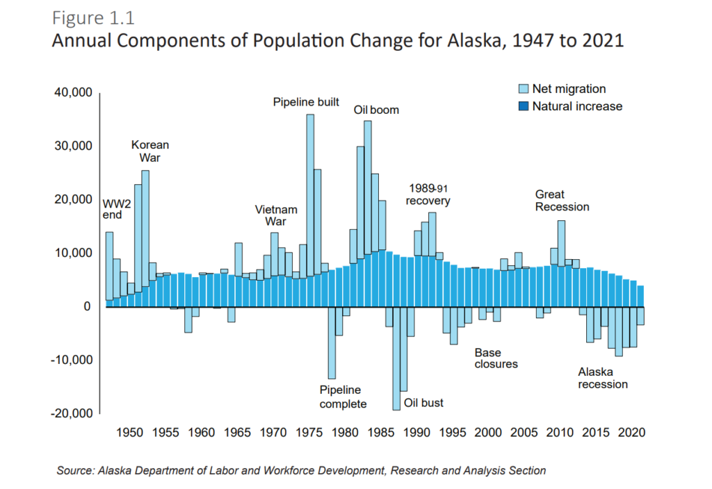
Below is a second version of the Population Change graph. It was actually in the original publication, Alaska Population Projections, 2021 to 2050, while the first was a stand-alone pdf. As several students noted, the version we published on the website doesn’t have negative numbers for the numbers below 0. Interestingly, this original graph does! What other differences do you notice? Which changes do you think make the ideas more or less clear?
Other questions from students to continue to think about and research:
- What would it look like if this graph were extended back to earlier times, such as the Gold Rush, European colonization, or original Alaska Native settlement?
- Why were negative numbers bigger than the positive numbers?
- Why did so many people leave in the 2000’s?
- Why did the natural population rise more during the Oil Boom than at any other time?
Additional Resources:
- https://www.adn.com/alaska-news/2022/01/06/alaska-broke-its-4-year-population-loss-streak-in-2021-but-the-gain-could-be-short-lived/#
- https://live.laborstats.alaska.gov/pop/projections/pub/popproj.pdf
- Angst over youth migration emerges in Alaska campaign rhetoric and debates (Yereth Rosen, Nov 3, 2022, Alaska Beacon)
- Alaska’s population rose slightly in 2022 but more people continue to leave than arrive (James Brooks, Jan 5, 2023, Alaska Beacon)
Visualization Type: Bar Graph
Data Source: Alaska Department of Labor and Workforce Development, Research and Analysis Section
Visualization Source: Alaska Department of Labor and Workforce Development, Research and Analysis Section
I wonder why it said WWII ended in 1947 but it ended in 1945. I think this graph is out dated. It needs some improvements
Hi, Thea,
We used this graph to look at recent population, and it was published at the end of 2022, when they had finished analyzing data for 2021. Right now, people are working on analyzing data for 2022–does that make sense?
Lindsey
I notice that it tells us a lot about Juneau and my brain has more brain sells because I learned this I wonder why Juneau deceased when there was no more gold . I also wonder why it like that said have world war 2 end in 1947 but end in 1945?
Thank u for teaching us now i know that at one point in time morepeople where dying then being born.
I wonder why when the pipeline was complete so many people decided to leave?
I wonder why they said WWII ended in 1947. WWII actually ended in 1945. One thing I noticed is that the graph hasn’t been updated since 2021. When the oil boom happened I noticed that a lot more people came to Alaska.
I wonder why they said WWII ended in 1947. WWII actually ended in 1945. One thing I noticed is that the graph hasn’t been updated since 2021. When the oil boom happened I noticed that a lot more people came to Alaska.
I saw a lot of different lines, and words. It was interesting that it said WWII ended in 1947, even though it ended 1945. I think the graph could use some updates.
I wonder why the graph says WWll ended in 1947 when really it ended in 1945 and I wonder why the years are five years apart except for 1947 and 2021.
i noticed that there is few big spikeing in population
i noticed that there is few big spikeing in population
I noticed was that there are a few big spikes that people moved to Alaska for the Korean war, pipeline was built, and the oil boom.
I noticed was that there are a few big spikes that people moved to Alaska.
I noticed all of the color on the graph. I also noticed how the years are counting by fives.
I also noticed the Y-axis had population at the year it was years were on the X-axis
The pipeline construction and oil bust were the biggest spikes I think the pipeline construction had the most population because people needed to come help to build it.
And Oil Bust had the most decrease in population because the value of oil went up so people left.
i Like it
One thing that I noticed is that there are a lot of dates on the graph. A lot on the bottom. There were also numbers that are on the side that start at 30,000 then go down to 0 then it goes up again to 40,000 thousand. Another thing that I noticed is that It was last updated in 2021 and it started in 1947. One other thing that i noticed is that there are a lot of labels by the orange bars that are high. Also one wonder is where did they get this data from. One last wonder is that I wonder what happened before 1947
I noticed that when the graph talks about oil it goes higher and lower.I noticed is that the graph got bigger thrue 1947 to 1995.I also noticed past 1990 the graph was really low.
1. I saw that there were a lot of people declining in the pipeline completion in between 1975 to 1980 and the Oil bust in 1985 to 1990, it was because the job pay went down and people needed jobs.
2. I see that people increased in 1950 to 1955 and 1970 to 1975 and 1980, because there were big events and other things.
I notice WW2 end at 1947.
I notice Oil Boom is going down at 1985.
I notice Korean war start after WW2 end.
My family moved to Juneau because they thought it would be safer because where we used to live was in LA and because more family was down in Juneau. I also noticed about the graph that during the oil boom more people came or left during that time and that the WWII “ended” in 1947 when it didn’t so why did they put it in 1947. I wonder how they kept track of the events on the graph cause they all happened a long time ago but I think they just researched it and I wondered why the pipeline Construction was so popular.
My family moved to Juneau because they thought it would be safer because where we used to live was in LA and because more family was down in Juneau. I also noticed about the graph that during the oil boom more people came or left during that time and that the WWII “ended” in 1947 when it didn’t so why did they put it in 1947. I wonder how they kept track of the events on the graph cause they all happened a long time ago but I think they just researched it and I wondered why the pipeline Construction was so popular.
My Father moved here from Astoria, Oregon years before I was born. I notice that the graph starts in 1947 and says WWII ended then, when in reality, it ended two years before, in 1945. I wonder what caused the AK recession.I also wonder what caused the oil boom and oil bust. A headline could be “The many population changes/ important years of AK”.
My family moved to Juneau because they needed a better job because back in the Philipines people don’t pay you that much.
I noticed that on the graph the blue looked like hills and the orange looked like tall buildings and that the year shows on the bottom from 1947 to 2021.
I also wonder how they kept track of those things.
The headline could be the important years.
In this graph, I noticed that there are a bunch of dates all but one is going up by 5s.
This graph connects to a lot of wars like the end of the Korean war and other things.
On the bottom of this graph, there are dates but on the side of the graph, there are numbers may be an amount of money. there are different events that are happing in this photo like the oil Boom
I noticed that in the graph there are huge events such as the Korean war, WWII, oil boom, the oil bust and how the bars went up and down during those events. I wonder why they had made these graphs or if there are any other graphs like this but one that is for another state. A good headline for this could be The Decrease and the Increase.
In the graph, I notice how during the oil boom/oil bust. That was the most when people died during that event. Also, I wonder why it only starts at the end of WWII, Alaska had the golden rush back then during the 1880s.
One thing that I noticed is that there are a lot of dates on the graph. A lot on the bottom. There were also numbers that are on the side that start at 30,000 then go down to 0 then it goes up again to 40,000 thousand. Another thing that I noticed is that It was last updated in 2021 and it started in 1947. One other thing that i noticed is that there are a lot of labels by the orange bars that are high. Also one wonder is where did they get this data from. One last wonder is that I wonder what happened before 1947
POPULATION CHANGE COMMENT
My family moved here because of my dad’s job. One thing that I noticed in the graph is that there is a time line at the end of the graph. One thing that I wonder is what the graph stands for.
I noticed that the information for the graph was recorded every five years except for in between the years 1947 and 1950. Some wonders that I have are who made the graph or why they choose the colors blue and orange. A headline for this graph could be The Rise and Fall of Population.
In this graph I noticed that the populations seemed to spike during wars and drop much less after. With the exception of Vietnam probably due to the soldiers staying to help build the pipeline. During the oil boom a lot of people came almost as much as the people who came to build the pipeline. If you were to combine the pipeline completion and oil bust then added pipeline construction along with oil boom, and subtracted the amount of people who left compared to how many people came you would have a much greater number of people who came.
I noticed that there is no data on 2022 and 2023, will you guys ever have an update for 2022 & 2023? And why do we even need this chart, we already know all this stuff. And I noticed there are orange grafts/hills that have no name/date, why are they there?
Kira,
I’m interested to know where you learned all of this before! You saw this before we did it in class? It will be challenging to do a graph for 2023 when 2023 just began, but I imagine a graph from 2022 will be possible in the coming months to weeks. Thank you for your participation in our class activity.
I noticed that oil that we had in Alaska brought and took away many people it was interesting that that many people came for just a job. I also noticed that Alaska lost a lot of people to Covid from 2018-2021. The last thing I noticed was that all of the wars that it shows it always brings more people than it takes away.
POPULATION CHANGE COMMENT
I notice that the data is collected every five years. I also noticed that the first time data was recorded was in 1947 and the last time it was recorded was in 2021 which are not multiples of five. Lastly people moved here the most during the pipeline construction and moved away the most during the oil bust.
I see a bright blue that is almost like baby blue. I see that on the side there are numbers that look like years. I notice words that connect to the end of WWll.
I noticed that in the pipeline construction more people moved to Alaska because of good paying jobs. People also started moving away because of the pipeline completion because of no more job. but lots of people moved to Alaska in 1980 because of the oil boom but then in 1986 people moved away because no oil
I noticed that their is something called the oil boom.I also noticed something called a oil bust. I wonder what the graph would look like just for Juneau.
I notice that it says net migration and natural increase. I wonder why it has some names of wars. I also notice that some of the lines on the graph go down.
Is it just me or does the graph look like a city? I wonder why it only shows the years 1949-2021. why is the word net in front of the word migration.
I wonder why the natural increase got so many people around 1980 to 1985. I wonder why so many people came during the war. I wonder why the natural increase got so low in 2021.
oreng blou i hate the graf im an oreng on the graf my brother is also an oreng
…………………………………………………………………………………………………………………………
Jared,
We are so glad that you recently moved to Juneau and, therefore, would be represented by the orange color if 2022/2023 are added to the graph.
I noticed there is more net migration than a natural increase in the graph. I wonder why so many people migrated. I’m guessing they counted WW2 end when everyone thought “Hitler is dead” even though his body wasn’t found. I don’t know exactly why my ancestors moved to Alaska. I wonder why a person would make this, and for what reason they did.
i hate this comment on graf
I like the graph because it has years of events and how the events effected the population of Alaska! Like Oil Boom the population went up a lot but when the Oil Bust happened the population went dawn a lot.
I saw that world war 2 ended when this graph started. Also I found that there was an oil boom and a lot of people came in. I think when all the people left it was because they ran out of oil. I wondered what AK recession meant so I still don’t know. I found almost right after world war 2 ended a Korean war started why? for the Korean war why did so many people come, were they drafted?
What I noticed in the graph was the decrease in population in 2021 because of Covid, I know almost every one has been infected by covid or a family member has. Another thing i had noticed was in 1980 there was a Huge increase in population because of oil, a big chunk of people went to Juneua because of the oil, but when the oil dried up they seemed to move away.
i find it interesting that so many people migrated to Alaska through 9145 to 2021. but it is so cool to see the amount of workers that worked on the pipeline .
IDK
In this graph from 1970-1995, there are a lot more events including the Oil Boom and the Oil Bust, than other years! I also noticed it says WWII ended in 1947 instead of 1945, I wonder why!
I have some questions for this graph like: why not make a graph about Alaska inflation or gas prices? Maybe even erosion? I also noticed that the population spiked when the wars happened. As well in 2020 (when covid happened) there was a big decrease in population.
Sylas,
They may have additional graphs on those topics, but we looked at this graph for our class because it best connects to the start of our unit on Ancient Greece.
I wonder why they said wwii ended in 1947. Wwii actually ended in 1945.
I wonder why so many more things were happening in the earlier years than the later years. I notice that the orange rectangles are many different heights while the blue rectangles stay mostly steady.😸
In this graph I noticed that the graph is mostly wars and not a lot of other events on the graph. I also noticed that the graph also had a lot to do with oil projects. One question that I have is why are the blue lines more steady then the orange spikes up a couple of ten-thousand and the blue only goes up a couple of thousands.
In the graph I noticed there were a lot of wars and oil projects. I was confused at first with the orange lines below the blue lines because there were no negative numbers, but, the graph was still great.
why did the graph only cover 1947 to 2021? what was the 1989-91 Recovery?
I see lots of lines, it’s kind of weird. I also saw lots of words…
weird graph. Its ugh. weird to see all the stuff that happened and all the years in happened in. And the population when the things happened.
I noticed the choice of color.
In this graph I noticed that the end of WW ll was in 1947 instead of 1945 why is that? I also noticed that there were a lot of wars on this graph like WW ll, Korean war, and the Vietnam war.
I notice words. Why is there color?
shylar
I wonder why so many people came to Alaska specifically around Wars.I also wonder why around the year 1975 to 2000 births were more common.
This graph has a historical connection to social studies, and Juneau is in Alaska.
I notice words. Why is there color?
What I noticed in the graph was that there were many years. I also noticed that the graph says that WW2 ended in 1947 when it really ended in 1945
Taylor
I saw lots of blue lines. What are all the numbers on the side for.
Sam,
Yes, the oil boom was caused by the building of the oil pipline. Did you have predictions about other booms (and busts?). There’s been lots of concern about these last several years since 2015. 2021 was the first time since 2016 that Alaska’s population didn’t decrease – and that was because of a thousand new personnel and their families coming into Eielson Air Force Base. For many, many years, Alaska’s cost of living was high, but so were the wages, so it was “worth it” for new people to come to Alaska. In recent years, though, Alaska has been in a recession (Alaska’s recession started later than in the rest of the US and is dragging out more), and while the cost of living has stayed high, wages are not (so) much better than in the rest of the U.S. That’s a problem with teachers, for instance.
I’m curious what you mean about how they should make it more self-explanatory; what would you add?
Thanks for writing in!
A great title for this I would feel like “Population of Alaska” also im curious what the oil boom was i wonder if it was caused by the oil pipeline. i noticed nobody’s been coming here as much since 2015. I would also highly recommend this to other classes Because this was interesting to learn but they should make it more self explanatory.
I feel like a catchy headline for this would be “The ups and downs of Alaska”
Also i would highly recommend this graph for other classes because it gave a lot of info and it also made sense.
I feel like a catchy headline for this would be “The ups and downs of Alaska”
On the graph, it looks like after the Korean War, the oil spike happened, along with the pipeline construction. I also noticed that on the graph, there are no negaitve signs for the numbers below 0. One thing that I wonder is if the same oil spike happned during the war on Ukraine and Russia. If this was a headline, I think a good name for it would be Alaska Population Expansion and Abate.
When looking at the “Components of Population Change for Alaska” graph I noticed it included various things, like multiple wars, oil information, and more. I wonder why the migration is mainly larger than the natural increase. The graph relates to my community because it shows the spikes and downfalls in the Alaskan population between 1947-2021. I think that having a more scientific name like “Components of Population Change for Alaska” is better for a graph like this.
I notice that after WW2 the population in 1947 is less than between 1950-1955. I also notice that the Natural increase was the most when the oil boom. I wonder why the oil bust is the most components. I also wonder what the graph is used for. This graph relates to me because the oil is also high for me. The population is important is the catchy headline.
i looked at the graph and i wondered why had so many people come to Alaska during wars and then left after the war this place is beautiful. this relates to me and my comunity beause the animals were. having less room too roam and we had to include all of the people whom came to Alaska.
i looked at the graph and i wondered why had so many people come to Alaska during wars and then left after the war this place is beautiful. this relates to me and my comunity beause the animals were. having less room too roam and we had to include all of the people whom came to Alaska.
Something I noticed about this graph is that the population goes up during wars. one thing I wonder about the graph is why the population goes up during the pipeline construction and goes down during the pipeline completion. I can relate to this graph because my grandpa came up to Alaska to work on the pipeline. a catchy headline for this graph could be, life in Alaska throughout the ages.
Penelope,
That’s interesting that your grandfather came to Alaska during the pipeline construction. As so many of you have noticed, many people left Alaska after the pipeline was built; I’m curious if you have any ideas about why he was one of the ones that decided to stay?
From the Population Change graph I wondered why so many people came during the pipeline construction. I know that a lot of people were there to actually help build it, but why did so many leave after the construction?
I did notice that there was a spike of people who came during wars. Was it because they thought it was safer in Alaska, or did they want to get as far away as possible?
I like the name of the graph all ready and think that it explains the point of the graph very well, but what if it was named something like Those Who Came and Went because the graph shows how people came and left Alaska over the years?
The graph is great, it’s simple but it also shows all the information it needs to. I would totally recommend the Population Graph to other classes interested in seeing how the population in Alaska changed over the years.
In the graph “Components of Population Change for Alaska 1947-2021”, I noticed that the population spiked when there were wars. I found this very interesting because I wonder what makes Alaska a good place to go during a war. I also noticed that there were no negative symbols before the numbers when they went below zero and I was wondering if there was a specific reason for this. I also think a great name for the graph would be “The People of Alaska”. Thanks!
The graphed we looked at was the Components of Population Change for Alaska, 1947-2021. I noticed that more people move away from Alaska when there is an incentive to leave, like the Oil Bust, than moving to Alaska when there is an incentive like job opportunities. I wonder what this graph would look like during the time when the gold rushes were happening. This graph is relatable because a lot of people who live here now moved or had family members move here during the events on the map it also gets you interested in Alaska’s history. I think it would be really cool if when you do other graphs with history you have some sources people can go to learn more about the events if they want to. A good title might be The Population’s Love, Hate Relationship With Alaska, 1947-2021.
Ali,
I’m glad this graph was relatable for lots of people and I agree that it’d be cool to have additional sources for people to go to. We started posting some sources on Friday in the new text with this graph and would love to post more. If you find any that you think are particularly useful or that you think that other students would find interesting, please let us know and we’ll post those. Thanks for taking the time to make suggestions about how to improve this site!
I think that there should be negatives of the side of the graph to show that the numbers are getting smaller. I am from Fairbanks Ak.
Gretchen,
I agree. Negatives would be a big help!
I notice that the population jumps higher when a lot of events are going. I also relate to the community because some of the people could be from my family
The graph we looked at was “Components of Population Change for Alaska, 1947-2021.” I noticed that the net migration would spike every time there was a war, and the natural increase would start to rise after the net migration. I also noticed that the natural population rose more than it had in the past, or would in the future, during the Oil Boom. Why did the natural population rise more during the Oil Boom than at any other time?
Two things I noticed on our monday graph is that it seemed to be a really big spike every 15-20 years/ when there was as war. Another Thing I noticed is that the number on the bottom didn’t have negatives next to them, which got a bit confusing when I realized that.
why did so many people leave in the 2000’s. and why alaska so famous during the construction, i know that it was because of the oil but like did every go there just for the oil?
Braden,
There was a lot of money in oil. The oil companies were paying very good wages to work for them directly. Then there were lots of businesses that sprang up to support those workers – restaurants, clothing, etc. You could come to Alaska, work hard, make and save lots of money, and then go someplace else when that boom was over.
Relating to the population change graph, something that I noticed was that, after the Korean War, there is a migration decrease that is unlabeled. I wonder why there was migration to Alaska during the Korean War. This relates to my community because it might tell me about where some people came from, or when they might have moved here.
I would recommend this graph to other classes. This is because it provided information without being extremely complicated. Something that you could change is to add very faint vertical lines. I would add this because it was hard to see which population increase/decrease would go to which year.
A title that I think would be good would be: “Those Who Leave, the Population of Alaska”
After looking at the graph of Alaska’s natural increase and net migration I noticed a few things. I noticed that after a migration away from Alaska the natural increase slowed. I also noticed that people moved to Alaska during wars, like WWll or, Vietnam. I have several theories for why this is the case but I don’t really know. One more thing, If I were to name this graph I’d call it, “Growth rate of Alaska’s population.”
George,
It is certainly interesting looking for connections between the changes in the natural increase and changes in net migration. Natural increase is the difference between births and deaths (it’s called a natural decrease if there are more deaths than births). One thing, as you noted, that would affect the natural increase would be the number of people (of child bearing age). Any ideas about what else might have an impact?
I would think that many major events would change the natural increase, such as a recession.
The natural increase changes because the number of births or deaths change. Are you saying that major events such as a recession would change, for instance, how many babies are born because people would be more hesitant to have children (and more costs) when jobs are scarce? I’d agree with that.
Some other causes of change could be: a pandemic (deaths increase), shifts in the ages of people living in Alaska (more or less likely to be of child-bearing age).
One thing I noticed in the graph was that the oil spiked every time there was a war. also that there were no negative signs. I wonder why the negative numbers then there were bigger than the positive numbers. I also noticed that this relates to the community by having some members of my family being an effect of why the spikes go up at certain points.
Something I noticed about the graph is that a lot of people that went to Alaska for the pipeline construction left after it was completed. I wonder if there could be a part of the graph that shows how many people moved to Alaska during the gold rush. This affects me and my community because if the population gets lower then places will start closing down because there aren’t as many people buying stuff. I think a great headline for this would be, “How This Graph Affects You”. This is feedback for Components of Population Change for Alaska, 1947-2021.
Kaylee,
I agree that population ups and downs can very much affect you and your community and we’re all connected. You’ve made an important observation that we rely on a certain base population to buy from the stores, send their kids to schools, go out to eat at restaurants, etc! What are you seeing around you? Does it seem like more people are going or coming?
Something I am noticing is that places that used to be pretty busy, aren’t as busy anymore so I wonder if that has to do with the population. It feels like the population is decreasing more than it is increasing.
It’s been hard to judge population in these last few years because of Covid. Are there fewer people or are the people still in Fairbanks, but staying home more often? Alaska’s overall population had been decrease 2017-2020 and last year (2021) was the first year that the population had a slight increase. This article says that the increase is largely due to Fairbanks! “If not for the redeployment of F-35 fighter jets to Eielson Air Force Base — which brought about 1,000 new residents to the Fairbanks area — the decline may have continued.” https://www.adn.com/alaska-news/2022/01/06/alaska-broke-its-4-year-population-loss-streak-in-2021-but-the-gain-could-be-short-lived/
We looked at the graph “Components of Population Change for Alaska, 1947-2021.” Something that I noticed was that whenever there was a war or something large happening in the rest of the world, people moved to Alaska. I wonder if this is because they were in the army and moved up here to train, or if they moved up here to get away from what was happening. I think that a good headline for the graph would be “The Come And Go Graph,” because whenever there was a big increase of people moving here, it was always followed by a decrease.
Payton,
I think for sure some of the population surge during wars was people being moved up to train and then to be shipped off to fight. I’m curious about your wonder about whether people moved up to get away from what was happening. Do you mean in the rest of the US? Certainly some people have moved to Alaska at all times to “get away from it all” and try to “live off the land.” I don’t know whether more moved during wartimes or not. Now I’m curious about how different Alaska from the rest of the US during the Korean or Vietnam Wars.
I was thinking that maybe people moved to Alaska to get away from the constant news of war, or maybe they thought that since Alaska is so remote, it might be safer up here. There are no big cities that other countries would want to attack up here, so it would probably be safer. I wonder if there was less inflation and rationing up here?
I noticed that when major things happened like the Alaska pipeline being built the population spiked and it also spiked when there was war. I noticed that when the population spiked soon after the population decreased. I think that people came here to find work and when the work was done the people left to find more work. In my opinion, I think that people wanted to have something to do and when they finished they needed to find something else to do.
I notice after one spike it goes the opposite way. The spikes go up and down. The blue part is wavy. It goes up and down but it looks like waves. I wonder why so many people are leaving Alaska.
Cash,
What ideas do you have for why people are leaving Alaska? AND, do you have any ideas for how to keep people here? Do you know anyone who’s moved into or out of Alaska in the last few years and what their reasons are? Here in Juneau, the state legislators and local officials worry about how people are continuing to leave Alaska. I know people who have left because they can’t take the weather (Juneau is pretty rainy!!) or because they can’t find childcare for their young children or because they can’t find a place to live. Have you heard any of those reasons? Or other reasons?
I noticed that during the oil boom the population went up above 30,000. After the oil boom there was an oil bust and lots of people left. like most people have said you should add negative on the lower numbers. I think you really should have other schools do this. This is weirdly fun.
some things that I noticed about this graph was when wars were happening or when more jobs become available like when the pipeline was being built a lot of people moved up to alaska to work and when the pipeline was finished being built, people moved out of state. It is shown that people for the most part only came here for work and then left to find more work.
I noticed that during the oil boom the population went up above 30,000. After the oil boom there was an oil bust and lots of people left. like most people have said you should add negative on the lower numbers. I think you really should have other schools do this is weirdly fun.
Nathan,
I am so happy that you enjoy this and very curious to hear more what you mean about “weirdly fun.”
we looked at a prompt and it was a graph. the graph showed that people moved to Alaska when there was a war or something like that. my question is why. why on earth would people come to Alaska when a war or something happened. It would be great to have the graph show world war 2 and the begening but you dont need to I just think it would be nice.
Clint, As others have noted, jobs are a big motivation for people to choose to move. Sometimes people don’t get to choose where they move to. In wars, soldiers are moved to where the generals decide. Alaska became an important place militarily during wars in the last century for many reasons, but especially because it’s so much closer to Asia than the rest of the US (except for Hawaii) I agree that it’d be interesting to see how WWII – and WWI affected the migration of people into and out of Alaska. We’ll see if we can find an extension.
I wonder why the population grew in Alaska during the wars.
Something that I noticed about this graph is that the population seems to spike whenever there is something big happening. Such as the wars, pipeline construction and completion, Oil bust and oil boom, and a variety of other things. Something that I wonder about this graph is why the population decreased so much when the pipeline was completed. Maybe this was because the people who were building the pipeline only came up to Alaska to build the pipeline, then after it was built they went back down to the lower 48. Right now, I can’t think of any way that this graph relates to me. A title for this graph could maybe be Population of Alaska or something like that.
Amelia,
I think your “maybe” makes sense for why lots of people moved away. Have any of your family or ancestors moved within or to Alaska? Do you know what their motivations were?
Yes, both my parents moved here as adults and I have no other relatives who live here. My mom moved here after taking a trip to Juneau, loving it, then eventually moving. I’m not completely sure why my dad moved but I think it might have been for work.
I notest that dering the oil boom lots of people moved up here. they probobly whanted buissnes opertunetys. then at the oil bust lots of people moved away.
One thing that I noticed about this graph was that when the pipeline was being built lots of people moved up here and when the pipeline was done being built, people moved away. It seems as if people only came here for work and then left to find more work.
Claire,
Work is a huge reason that people move anywhere – so they can make money. Pipeline jobs paid well and drew lots of people to Alaska – plus all the jobs keeping the people working the pipeline fed, entertained, clothed, housed, etc.. And yes, when the pipeline was finished and those jobs were gone, people moved out of Alaska.
I notice that for every population jump there is a sag after that. I would recommend this to other classes. I think it is fun.
I noticed that this relates to the community by having some members of my family being an effect of why the spikes go up at certain points.
I noticed that there were a lot of red lines as well. and it would randomly spike when there was a war.
One thing I noticed was that people really liked it when we built the pipeline, my suggestion for making this better is what a lot of people have already said which is adding negative signs, I really do recommend the graph to other schools it was very helpful.
Addie and Anna,
Thank you so much for writing! I’m realizing that we need to do some work on this website so that it’s super clear which comments go with which graphs!
The graph that I see that goes above and below the 0 is called “Components of Population Change for Alaska, 1947-2021.” As you point out, the orange bars spike frequently – both up and down – and the first three positive spikes happen during wars. If that’s the graph you’re referring to, it does mention oil (boom, bust, construction), but it’s actually showing how oil is having an impact on population – on how many people are living in Alaska. Why do you think wars and oil production (or busts) would change the number of people living in Alaska?
I had the same wonder about the numbers below the 0 not having negative symbols. What would negative numbers – or numbers below 0 – mean about the population in Alaska?
Looking forward to hearing more of your thoughts about these graphs and others!!
There was one main thing that I noticed from the Alaska oil graph that confused me a little bit. I asumes that on the graph under zero was negative, but it was not marked negative. So I wonder if under the zero was negative and was not adding a negative symbol a mistake or on purpose.
In the graph i noticed that the oil spiked every time there was a war. also that there was no negative signs. I wonder why the negative numbers then there were bigger than the positive numbers. This relates to me and my community because they could also have the same questions. what is going on in the graph is how much oil spike during wars. a great name for this would me Alaskan Graphs.